
I built a tool for non-technical users — people who had never used a SaaS product before. Not “not very technical” — genuinely never signed up for a web app, never managed a dashboard, never thought about their workflow in terms of software.
Building SaaS for non-technical users is a different problem than building for developers or power users. I was convinced I understood the difference. I had done research. I had conversations. I had a mental model of the user that felt solid.
Every assumption I made was wrong. Not slightly off — wrong in the specific way that only becomes clear when you watch a real person try to use what you built and quietly give up.
This article is about what I learned from that experience. It’s also about the product decisions that changed once I stopped designing for the user in my head and started paying attention to the one in front of me.
The onboarding I designed vs. the onboarding they needed
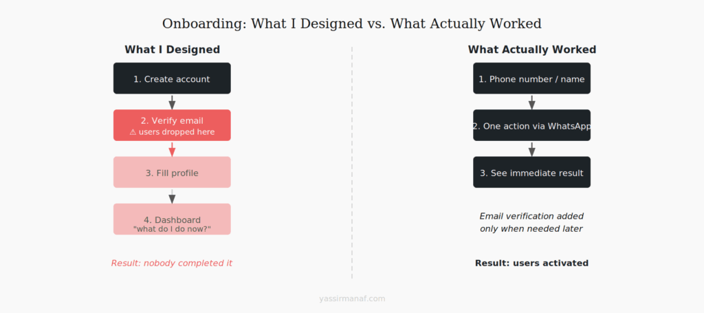
The onboarding I built made sense to me. Create account, verify email, fill in a short profile, land on the dashboard, start using the product. Four steps. Clean. Standard.
Nobody completed it.
I watched three users drop off at step two — email verification. Not because the email didn’t arrive, but because they didn’t understand why they had to click a link in their email to use a tool they’d just signed up for on their phone. The mental model of “verify your email” — something every developer treats as table stakes — was an unexpected interruption to them. One user thought something had gone wrong.
The dashboard wasn’t better. I had built something that made sense from a product architecture perspective: a main view, a sidebar, quick action buttons at the top. Clean, logical, standard SaaS layout. My users opened it, looked at it for a few seconds, and asked me what they were supposed to do.
The problem wasn’t the UI. It was that I had designed an interface for someone who already understood what the product was for. The onboarding assumed context the users didn’t have.
What actually worked: skip email verification until it’s genuinely needed. Get the user to a single meaningful action as fast as possible — not a dashboard, not a menu, a specific thing they can do right now. The first session should answer the question “what does this do?” not “where do I start?”
WhatsApp as a UI — why chat beat dashboards
At some point I accepted that the web interface wasn’t working for this audience and started thinking about where these users actually spent their time.
The answer was obvious in retrospect. WhatsApp. They were on it all day, every day. They knew how it worked. They didn’t need to learn anything new to send a message.
So I built a WhatsApp bot as the primary interface.
The difference was immediate. Users who had struggled with the web app started interacting naturally through WhatsApp — sending messages, responding to prompts, getting results — without any instruction. The interface was invisible because they already knew it.
This taught me something I’ve thought about a lot since: the best interface for a given user is the one they’re already using. Not the one that’s most elegant from a product design perspective. Not the one that scales best architecturally. The one they already know how to use.
For a different audience, the right answer might be email, or Slack, or a spreadsheet. The question worth asking early is: where does this person already live? Build there first, build the polished interface second.
The web app still exists and some users prefer it. But it’s not the primary path anymore. That decision came from watching users, not from architecture preferences.
The feature they asked for vs. the problem they had
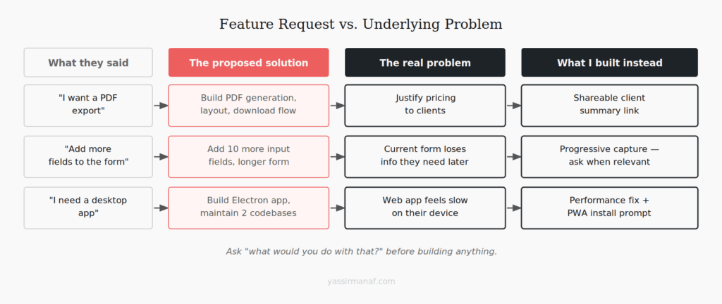
Early on, users asked me to add a reporting feature. Specifically: they wanted to be able to export data as a PDF they could print and show to clients.
I almost built it. It would have taken a few days, it was a reasonable request, and multiple users had asked for it independently so it felt like validated demand.
Then I asked one of them what they’d actually do with the PDF. The answer stopped me.
They wanted something to show clients to justify their pricing. The PDF was just the format they’d imagined — because PDFs feel official and printable. What they actually needed was a way to communicate value to a client who couldn’t see their work directly. That’s a completely different problem.
I built a simple shareable summary instead — a link that showed the client a clean view of what had been done, without any export, without any PDF. It took less time to build, users adopted it immediately, and I never heard another request for PDF export.
The lesson isn’t that users lie about what they want. It’s that users describe solutions, not problems. “I want a PDF export” is a proposed solution. The underlying problem — I need to justify my pricing to clients — is what you need to understand. If you build the solution they described without understanding the problem, you might build exactly what they asked for and still miss what they needed.
I ask “what would you do with that?” for every feature request now. It’s the most useful question I’ve found.
How I run user research when users don’t speak “product”
Standard user research methods don’t transfer cleanly to non-technical users. Asking someone to “walk me through your workflow” assumes they think in terms of workflows. Asking about “pain points” assumes a vocabulary that doesn’t always exist. Most of my early research interviews produced polite, vague answers that didn’t tell me much.
What actually worked was watching, not asking.
I started sitting with users — physically or over a video call — and asking them to show me how they did their job before the tool existed. Not how they used the tool. How they worked. Pen and paper, WhatsApp voice notes, photos of handwritten notes — the actual, pre-software version of what I was trying to replace.
That research was more useful than anything I’d gotten from structured interviews. I learned where the friction actually was, not where I’d assumed it was. I saw workarounds that made no sense from the outside but were completely logical given the context. I understood why certain features I thought were important were irrelevant to them, and why certain things I’d treated as edge cases were actually core to how they worked.
The other thing that worked: short feedback over time, not long sessions upfront. A two-minute WhatsApp voice message asking “what was confusing today?” after a week of use gave me more signal than a one-hour kickoff interview. Users notice friction when it happens and forget it a week later. Catch it close to the moment.
Build for the user in front of you, not the one in your head
There’s a version of every product that makes complete sense to the person who built it. The architecture is clean, the UI follows best practices, the features map to a rational mental model of how the product should work.
That version often fails with real users — not because the builder is wrong about the problem, but because they’re building for a user who shares their mental model. Which is rarely the user actually in front of them.
The shift that mattered for me was treating my assumptions as hypotheses instead of facts. I thought email verification was a non-issue — hypothesis. I thought a dashboard was the right first screen — hypothesis. I thought users wanted PDF export — hypothesis. Every one of those needed to be tested against real behavior, not validated through my own logic.
The users who taught me the most weren’t the ones who complained loudly. They were the ones who quietly stopped using the product and never said why. Chasing those users down and understanding what happened was more valuable than any positive feedback I got.
Build fast, watch carefully, change what the evidence says to change. The user in your head is a useful starting point. The user in front of you is the product.
Building for a non-technical audience? I’d like to hear what surprised you. Find me on LinkedIn.
Leave a Reply